This project was part of an elective course titled Packaging, where we were tasked with creating a cohesive design series. The goal was to design a set of three distinct outcomes that were linked together in concept or theme. For my main outcome, I chose to design a vinyl cover inspired by the 2023 animated film Spider-Man: Across the Spider-Verse. As both a dedicated Marvel and Sony fan, I wanted to create something that not only paid homage to the characters but also captured the essence of the movie's complex themes and visual style.
For the vinyl set, I designed two covers that represented the two central characters of the film—Miles Morales and The Spot. These characters embody contrasting aspects of the Spider-Verse, so I aimed to represent a "good vs. evil" dynamic within my designs. However, I intentionally kept the narrative open-ended, not revealing too much, allowing the audience to engage with the concept and make their own interpretations. The design itself employed a portal-like motif, a visual element using half-tone inspired by the movie's comic and multiverse theme. This portal effect encouraged the viewer to immerse themselves in the world of the Spider-Verse, as though they were peering through a gateway into another dimension.
Each vinyl cover was carefully crafted to reflect not only the personalities of these iconic characters but also the larger, more abstract ideas explored in the movie, such as identity, choice, and the balance between order and chaos. By blending these visual elements, I sought to create a design that was both visually captivating and thematically resonant with the core of the Spider-Verse experience.
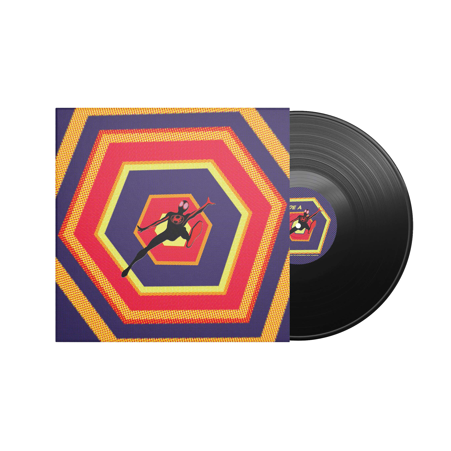
Vinyl record sleeve 1, showcasing Miles Morales falling through a dimensional tunnel using half-tone to create illustrative depth
For this project, I aimed to stay true to the aesthetic and branding of Spider-Man: Across the Spider-Verse, while also infusing my personal artistic touch into the designs. I wanted the vinyl covers to reflect the film’s visual language—its bold colours, dynamic compositions, and modern feel—while simultaneously adding subtle elements from illustrations to make the designs uniquely mine.
My approach was to keep the covers minimalistic, focusing on the most essential elements to create an impactful design. I chose to highlight the distinct portal design from the film as a central motif, allowing it to take centre stage on the covers. This portal, a visual representation of the multiverse concept in the movie, became a symbolic gateway into the Spider-Verse, and I wanted this element to stand out, encapsulating the sense of wonder and exploration that the film conveys.
In addition to the portal design, I made sure to include a single character as the focal point of each cover. This helped maintain clarity and simplicity while still showcasing the characters’ significance. Each character was carefully positioned to reflect their individual storylines and personalities, ensuring they were not only visually prominent but also thematically resonant with the Spider-Verse narrative. By balancing these key design elements, I hoped to create a series of covers that were visually striking, conceptually cohesive, and true to both the spirit of the film and my own creative vision.
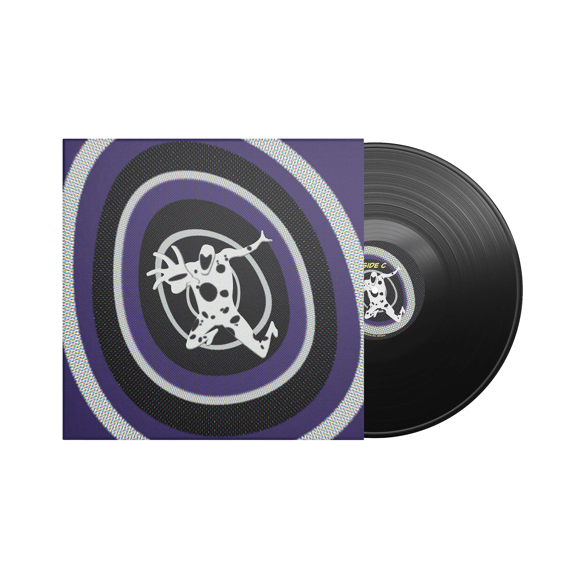
Vinyl record sleeve 2, showcasing The Spot rising through a dimensional tunnel using half-tone and depth